An Approach to Practical Art in the Classroom – Images of Art from Breaffy N.S.
The revised primary curriculum on the visual arts states that the teaching should be ‘structured to provide a broad-based and balanced programme’ for the various age groups. In furtherance of these aims it suggests that attention be devoted to six strands, namely drawing, paint and colour, print, clay, construction, fabric and fibre. This suggests a broad-based, also known as a breath approach, as against a depth approach where pupils would concentrate on a few materials that would be explored more fully. With the strictly limited time devoted to art education in the primary school, the question must be asked, if pupils are going to have sufficient time to explore a wide variety of materials and at the same time demonstrate that they can respond in a creative manner throughout.
Research conducted in the United States has found in favour of a depth approach in order to ensure greater spontaneity and creativity. (For a report on the depth versus breath approach, see Creative and Mental Growth, by Viktor Lowenfeld and W. Lambert Brittain, Macmillan Publishing Company. (The reference to the research is Beittel, Mattil et al. 1961, and also MacGregor, 1967)
The revised curriculum, despite its emphasis on a broad-based approach, states that drawing has primary importance in the curriculum. (Incidentally, the same could be said of painting). To quote from page 13:
“Drawing has primary importance in this curriculum. It is through drawing that children's development in art is most evident. Because it is something most young children do naturally, it is particularly important in promoting visual awareness and the ability to record what is seen, felt or imagined. Drawing activities also help to develop a confident and expressive use of materials and tools. ”
AN INTEGRATED CURRICULUM.
Without gainsaying the merits of the approach to the teaching of practical art in the revised curriculum, for the purposes of this review we will concentrate mainly on drawing and painting. Experience of teaching art shows that above all, children love these two activities. The argument has been made that children need the variety of a range of materials or else they will become bored with pencils and paint. However, interest can be maintained by ensuring a variety of topics and subjects for the art lesson, and by integrating the lesson with looking and responding lessons, with religion, stories, poetry and environmental studies. Then, provided the art exercise is not reduced to mere illustration the children can empathise with the experience in question. In order to establish empathy it will be necessary to help the children to focus in on the task in hand by beginning the lesson with a discussion of the topic – how would you feel if this were you or if you were there, type of questions? Such an approach deepens the understanding of these subjects in addition to providing an opportunity for self-expression. To some extent, then, art can become the core of the learning environment within the school.
For infants and the younger children, drawing will be an every day experience and not treated as a separate subject once a week. (See Chapter 15 for further details). Drawing materials can be limited to pencils, biros and crayons, and on occasion, pen and ink and pastels with older children. Much of the subject matter can revolve around the human figure: portraits, groups, the human figure in action, and the figure in the landscape. By narrowing the focus in this way, children will make greater progress and will have more time to express themselves in a meaningful way. But the greatest stimulus and inspiration for practical work can often come from showing and discussing works of art in the classroom. (See chapter Looking and Responding).
THE PAINTING LESSON – MIDDLE TO SENIOR CLASSES.
1. Choice of Subject.
Probably the most important consideration in the teaching of art is choice of subject. Subjects with a strong emotional content seem to evoke the best response from children of all ages. Through art we can cater for the development of emotional growth by providing the children with expressive outlets.
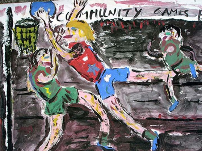
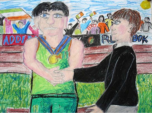
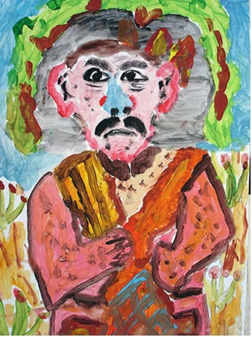
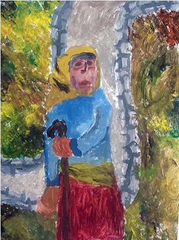
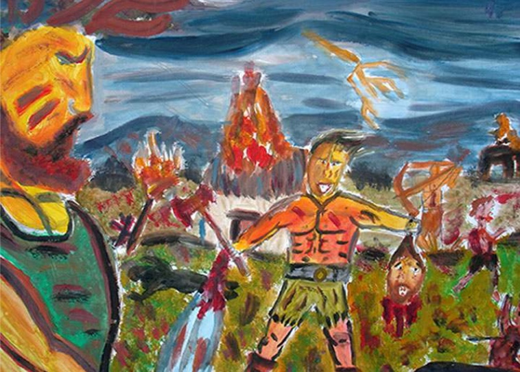
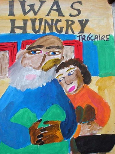
Some topics for younger children are suggested in Chapter 15. Here are a few suggested subjects from third to sixth classes: monsters, witches, dragons, pirates, a nineteenth century peasant, the prisoner, the bully, a homeless man, King Herod, the Prodigal Son, the Demoniac who lived in caves, a famine victim, an adventure, lost, fishing, at the seaside, an accident, games topics, and subjects arising from poems, from the story being read to the class, subjects from history (Viking attacking a monk), self portraits, portraits of others in the class, seasonal themes and topics, Christmas, for example. Also environmental topics: the fierce predator, the eagle grabs his prey, tree killed by acid rain, the old gnarled tree, polluted lake, the lovely things under the sea and other wild life topics.
Then as a further development - subjects with more than one figure. A later challenge will be found in the effort to paint the figure in the landscape, for example, a famine victim. Posters: eg. design an alternative book cover for a book that has been read.
Again, to stress that no matter what the subject, it must have heightened emotional content. It is important to make the drawing big – for portraits, often just head and shoulders. In big drawings the emphasis is on the facial expression. As an aid to the practical work, lessons in looking and responding will be most helpful. For example, if the children are working on portraits, the opportunity to examine and discuss portraits by the great artists should not be overlooked.
Again to emphasize, the most important preparation for the art lesson is discussion concerning the character or subject of the lesson at the start of the session. Subject: King Herod. What kind of person was he? Various ideas will emerge. Was he cruel, violent, vain, vengeful, selfish, greedy, uncaring, angry, etc? Can we aim to portray some of these qualities in our work?
2. Colour.
The teacher can discuss the use of colours with the class. What is the best choice of colour for King Herod or other subject? Do certain colours symbolise various feelings or emotions? Blue can indicate sadness or loneliness while in another painting it might symbolize peace. Red can symbolize violence, anger, despair as in Expressionist paintings. Green and yellow for life, happiness, joy. A bright toned painting might indicate contentment, rest, and happiness. A dark toned painting might indicate death, despair, and melancholy. Muted colours might indicate a peaceful or tranquil mood.
Lots of contrasts of pure colours can indicate drama, clash, disagreement, excitement, and liveliness. Red is a contrast to green, orange to blue, yellow to purple. Revulsion can also be an appropriate response. Discuss paintings where colour is important.
If the aim is for contrasting colours, then the background could be done in a light, medium or dark shade of blue when the principal subject is mostly in yellow-orange to red colours. These are not meant to be rules.
Note that dark brown and blue will give almost a black. Look at some paintings for examples.
3. Colour Families.
In looking at paintings we will sometimes find colour schemes of closely related colours, or colour families; for example, the family of warm colours - yellow, orange, red and the browns. Most paintings will have a dominant colour with a few subordinate colours.
The cold colours: blue, purple, lemon yellow. Green can be warm or cold. A lot of yellow mixed with a little green makes it warm. With more blue than yellow it becomes cold, bearing in mind that yellow and blue make green.
In the senior classes, children will have discovered something about colour mixing. A mixture of yellow and blue gives green, yellow and red makes orange. Red and blue gives purple.
Of course, instead of mixing yellow and blue to make green we can simply use viridian green mixed with a little yellow to produce a cool green and a lot of yellow for a warm green. White can then be added to these mixtures to lighten them.
Older pupils please note that green straight out of the bottle of paint may not always be the best choice.
By adding a lot of white to a colour we can lighten its tone. By adding a little black we can darken its tone.
4. Warm Greys.
Either of the browns can be used without mixing, but white can be added to either of them to obtain some nice pale warm greys. A misconception about greys is that they are obtained by mixing white with yellow, red, blue or green. Such mixtures only produce a lighter shade of those colours. Adding black to either of the browns will give a warm dark grey. Ultramarine blue plus dark brown produces an almost black tone. Try mixing either of the browns with deep yellow or orange to get some lovely bronze colours – also greys.
A warm greyish brown colour scheme would suggest a restful, tranquil mood. As an exercise, paint an abstract pattern, based on the colours from William Turner's painting, Petworth Park.
5. Cool Greys.
How to mix a grey blue? White and blue would give a grey-blue. But one other colour might be needed with those two. Look at Monet’s Snow at Argenteuil. How did he obtain these grey blues and greens which he saw through the falling snow? Could the class experiment to see if anyone can mix these grey-blues and greens?
This exercise could be the basis for a lesson on abstract art by using the colours from Monet’s painting to paint an abstract pattern – big shapes and small, dark and light shapes, regular or irregular, shapes with soft, jagged or hard edges.
At all times we should avoid over mixing of colours. Two colours plus black or white is enough to mix. Children should avoid using dirty water as this will result in muddy colours. Also avoid constant dipping of the brush into water. Children sometimes end up painting with muddy water and very little paint.
6. Thick or thin paint?
A painting done in very watery colours with little variety or contrast could be finished by letting it dry and then painting over it with thick paint, using more varied colours and contrasts, having discarded the jars of water. A painting may be done like a water colour, using watery paint. Alternatively, a painting may be completed in one session, using thick paint and no water. Brushes can be cleaned with a piece of newspaper. The jars of water should often be banned from the art lesson.
7. Tone.
As an introduction to awareness of tone, paint a figure or portrait using black paint on white paper. Tonal contrasts are important where a limited number of colours are used. In portraits, there can be contrasts of tone between the foreground and background. In this connection, discuss paintings by J. B. Carot.
When the principal subject (portrait etc.) is painted in bright tones we should sometimes aim for a background in dark tones, and vice versa. Bear in mind that it is not always necessary to use pure black. Instead, to obtain a more lively black, a little black can be mixed with dark brown. Also try mixing a little black with blue or red to produce a cool or warm black. It will be found that only the smallest amount of black is required to get a dark tone.
8. Textured Surfaces.
Older pupils please note that rough textured surfaces can be produced by making a mark and leaving it and avoiding repeated rubbing over the same area with the brush. The mark may be a stroke, a dab or dot. As the children mature they can be made more aware of a variety of textures.
The class can look at Impressionist or Pointillist paintings where dabs or dots will often be placed over an underpainting or over a white background. Use thick paint for rough textures.
For background textures in portraits, we can try lines, dots, little circles, squares, etc, placed over a thin colour wash in a tone allowing the main subject to stand out. Often the background will show a real place, either an interior or landscape.
In painting dress (older pupils), the children can aim for some kind of pattern in clothes. At all costs, we must try to avoid covering a large area of the page all in the same colour without any change in tone or any detail. Art must have variety.
Senior pupils can be introduced to shading in order to get three dimensional effects in people, buildings, trees, mountains. For example, try lighter colours on one side of a face or body, with a gradual change to darker colours for the opposite side. This was often the Impressionist and Post-Impressionist method of shading – using a variety of colours in modelling (yellow, orange, red, purple, dark brown, for example).
The other method of shading is to use tones of just one colour (Pre-Impressionists), starting with the lightest tone of brown on one side, leading to the darkest tone on the other. Use black or white in these mixtures. Looking at paintings which show both methods could be helpful.
How can arms stand out from the body? – Possibly by painting them in a lighter tone than the body.
Sometimes, in order to get finished, children will take a brush and just scribble over a large area of the page without purpose. This is unacceptable.
9. Style.
Looking at a variety of paintings by various artists will reveal a great many approaches to applying paint to a surface.
- The smooth careful finish of classical artists.
- The short dabs and broken colour of the Impressionists.
- The dots of the Pointillists.
- The heavy impasto of some of the Expressionists eg Van Gough. (Impasto means thick paint).
- The larger colour patches of the other Expressionists.
- The simplified flat, untextured areas of colour of Edvard Munch
- The use of line to cover large areas of the surface, eg Van Gough and some other Expressionists.
A useful idea sometimes for art lessons would be to paint a picture in the manner of Monet, Van Gough, or other artists. In the manner of Van Gough: thick paint. In the manner of Monet: short brush strokes or dabs placed side by side, either over the white paper or over a thin wash underpainting. Avoid smoothing the surface by repeated rubbing of the brush. This destroys the character of the work
10. Is Drawing Important?
Improvement in drawing skills is a natural development through the age groups, provided the children get the opportunity, and if the subjects are suitable and stimulating. Drawing is not taught by demonstrations or in ‘how to draw’ lessons. (See Chapter 15).
Opportunities for drawing should be provided as an exercise away from painting. If children have their own drawing copy they might do a drawing at home based on a character from a poem or story, or based on news.
Drawing and painting are two different skills. A child might be good at one and not the other. When the lesson is painting rather than drawing, a minimum of attention should be devoted to drawing, sometimes even doing no drawing at all. If a drawing is too detailed it can be impossible to paint and should be left as a drawing.
Drawing materials other than a pencil should sometimes be tried – oil pastels, felt pens, even charcoal for older children.
If pastels are used it might be an advantage to have a group of six to eight using them while the rest of the class use paint.
11. Techniques for oil pastels.
Oil pastels can be used the same way as paint. Techniques can include a light application of colour at first, over which lines, dots, dabs or patches can be placed. Dark colours can be painted over light colours and vice versa. Blending can be tried where two different colours meet. It might be best - certainly for older children - to cover the whole page with colour. Choice of colours will depend on the colour of the paper.
Aim for colour contrasts – eg. a reddish figure on a greenish background. For older children, aim for modelling and tonal contrasts.
With reference to drawing, children will develop their techniques and produce more realistic representations of the human figure as they mature. But let’s not forget that realism need not always be the aim. In looking at the world of art, children will see that artists - especially the Expressionists - use all kinds of distortions in order to express feelings.
This will be discovered by examining paintings by Van Gough, Picasso, Munch, and other Expressionists. Also look at the paintings of Jack B. Yeats. Such experiences will help the children to gain in confidence and come to realize that there is no ‘correct’ way to draw.
IN ART, THE MOST IMPORTANT THING IS EXPRESSION. Technique should not be allowed to get in the way. A distorted expressive drawing can often say more than any amount of careful, technically proficient work.
Discussion.
If discussion before a painting lesson is important, it is equally important afterwards. When dry, the paintings should be put up on the notice board where they can be seen by all. How successful were we? Did we succeed in expressing feelings? What feelings are here? Do different pictures show different feelings? Did we cover the whole page with paint? In figure painting, how does the background relate to the figure? If we tried shading, how did we succeed? If this is a monochrome painting, does it have contrasts of tone? In a monochrome painting, tone is more important than colour. If colour is more important than tone in your painting, then do you have enough colour contrasts? How could a particular painting be improved? Is the painting finished? How is the painting of faces treated? Eyes, noses, mouth?
Obviously for younger children the questions will be much simpler.
Children's work on the notice board should be changed frequently.
Portraits and what else?
A development away from painting the single figure would be paintings of groups – indoor or outdoor or in a neutral setting. Useful subjects will arise from stories. (cf. The Bridge to Terrabithia by Katherine Paterson – Puffin Books, one excellent example of a novel to read to senior classes).
After that, the figure in a landscape, either a medium sized figure or figures, or the truncated figure near the bottom of the page. Show and discuss landscape paintings with people.
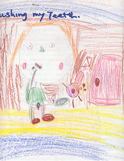
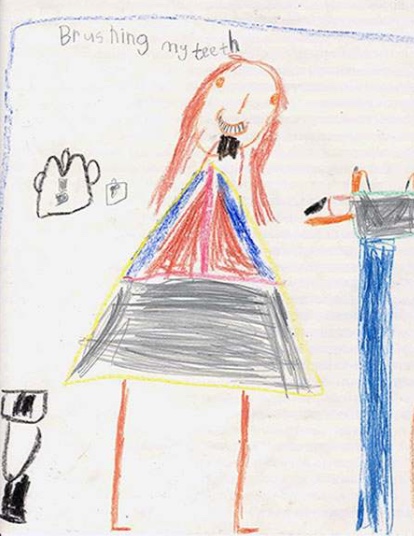
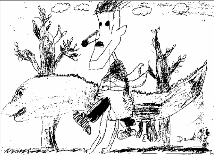
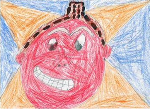
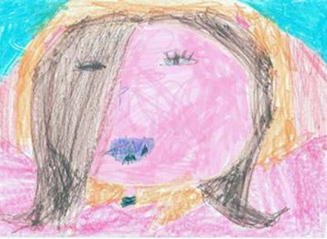
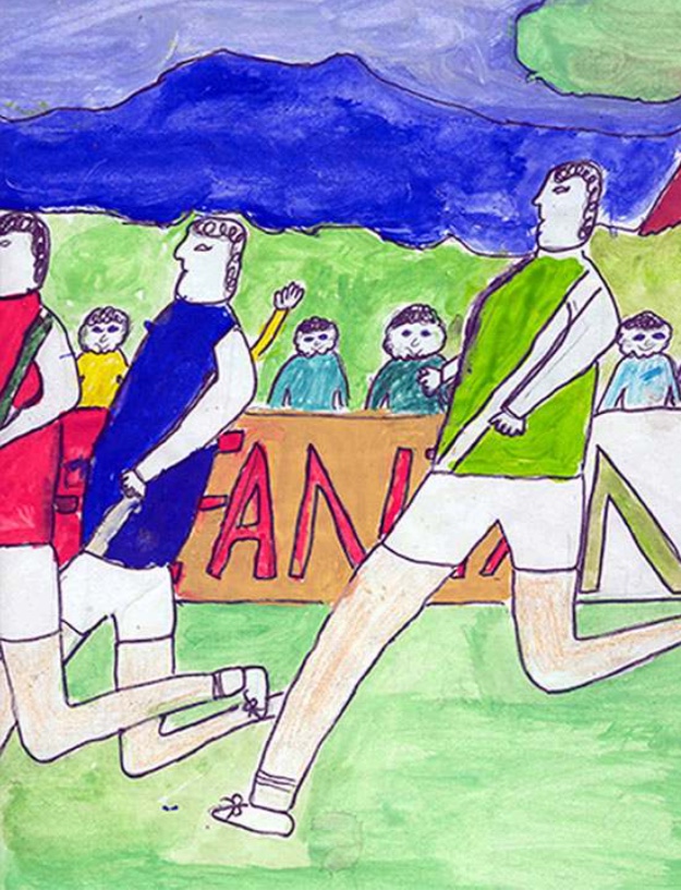
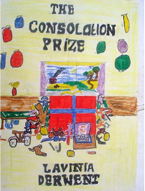
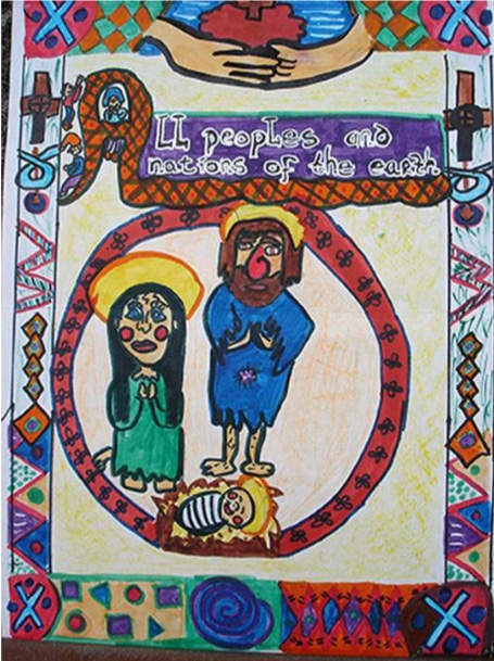
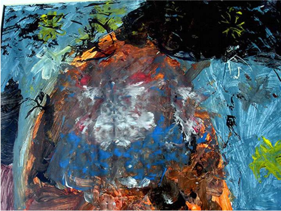
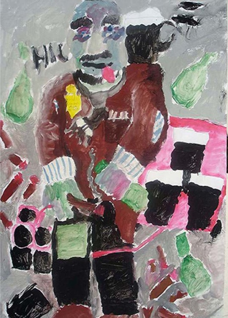
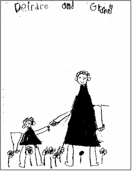
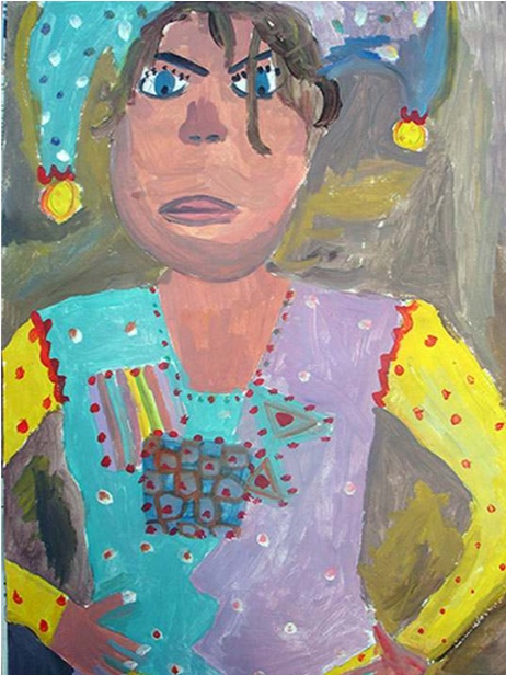
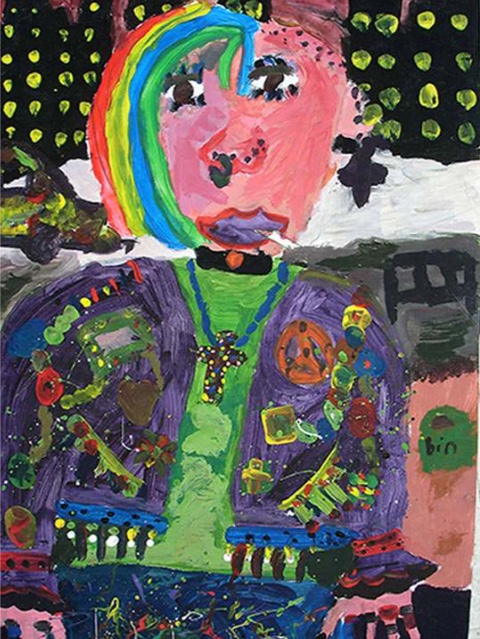
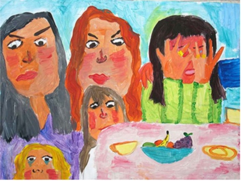
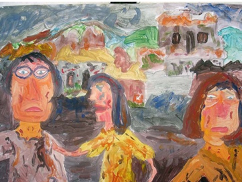
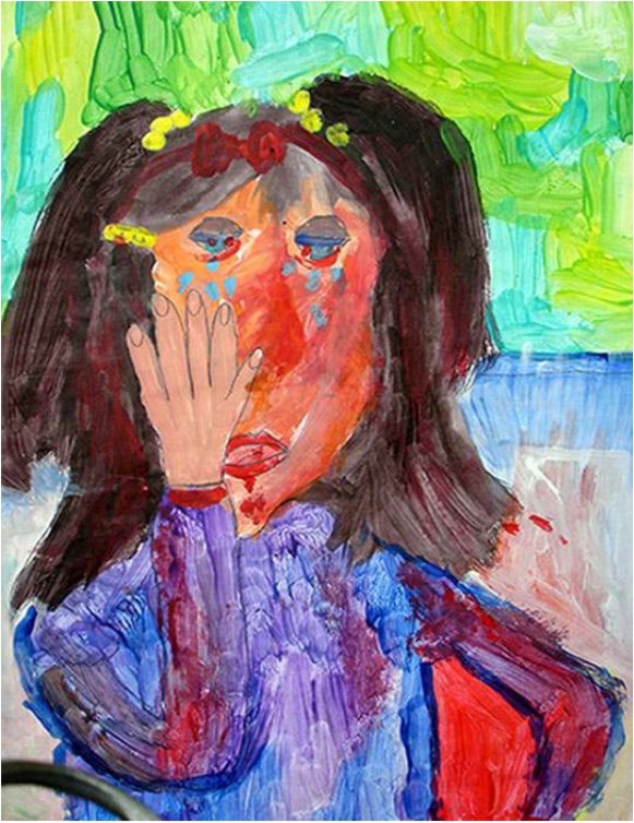
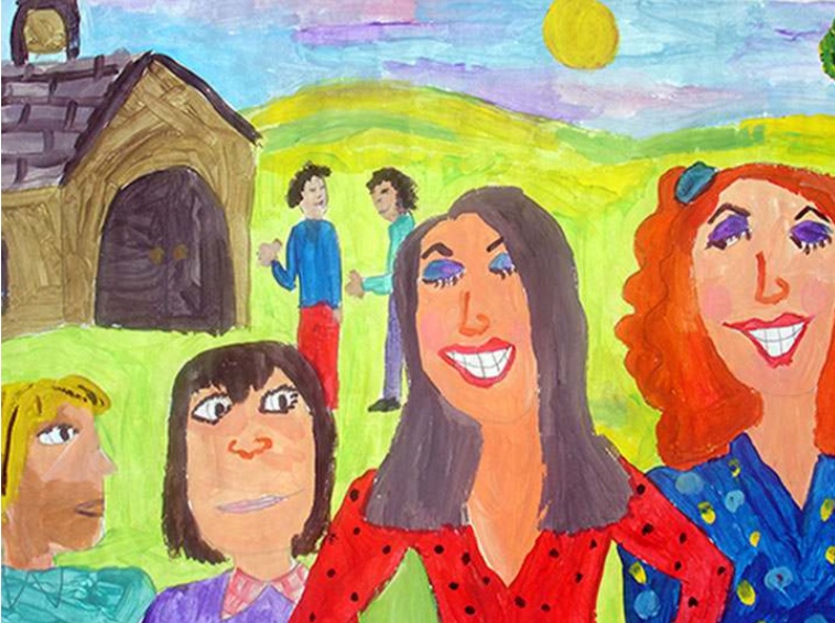
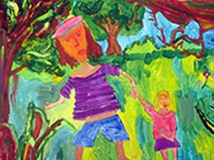
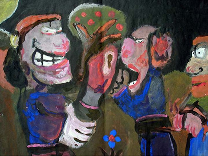
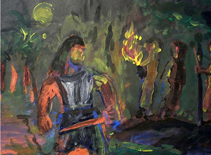
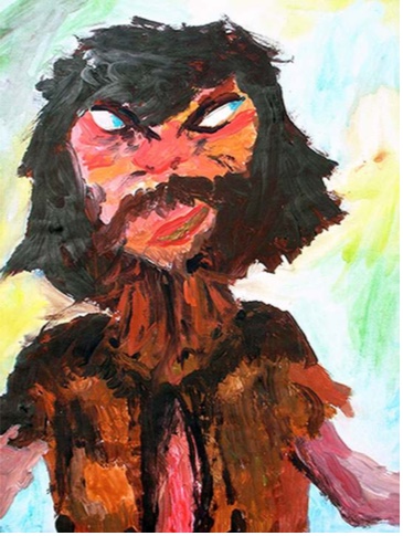
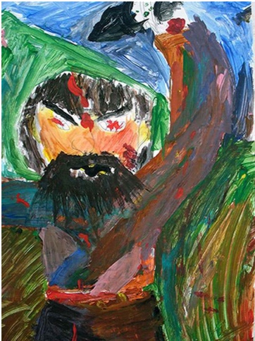
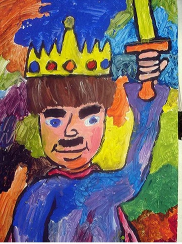
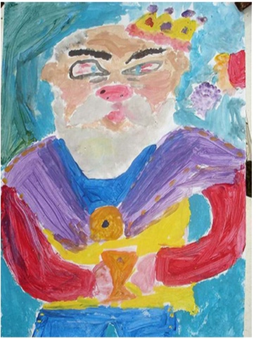
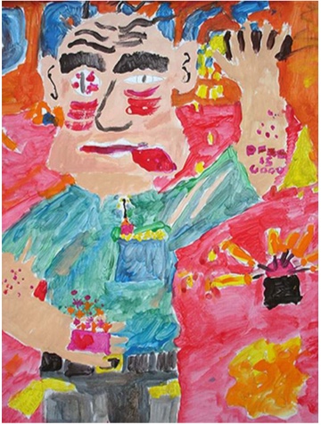
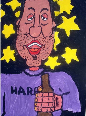
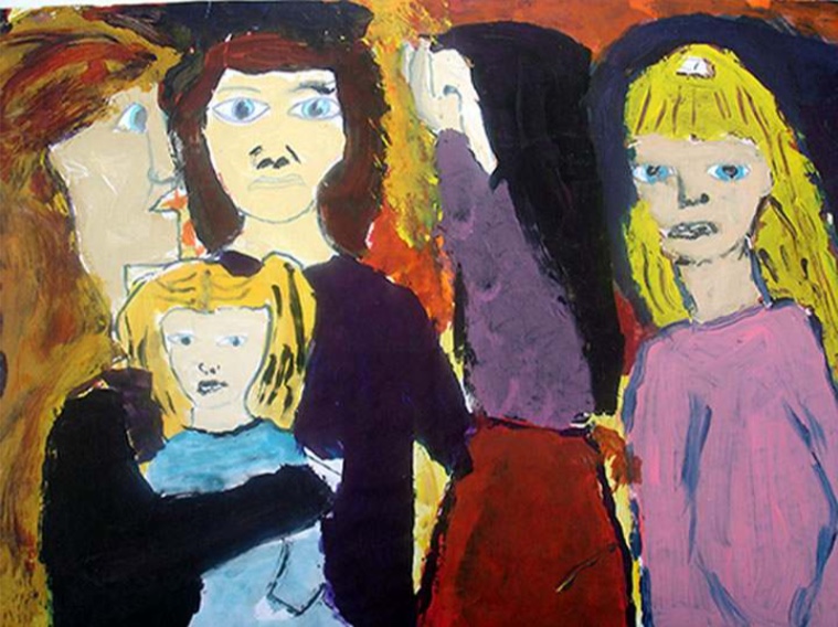
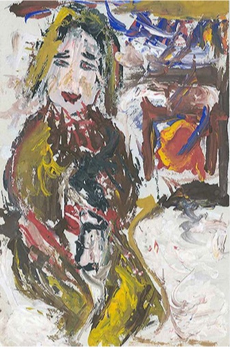
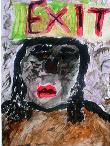
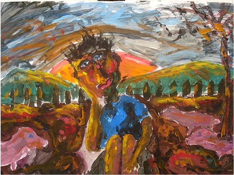
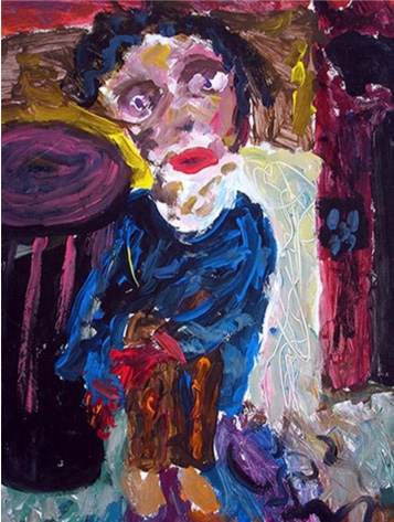
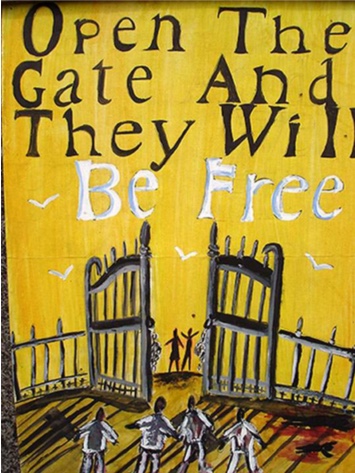
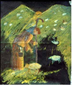
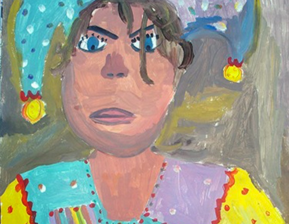
The following are some examples of children’s artwork from Breaffy National School.